Exploring Power BI examples shows how valuable data can become when it’s transformed into clear, actionable insights. Having the ability to turn raw data into these insights is more than just an advantage—it’s a necessity. Microsoft Power BI is a powerful business intelligence (BI) and data visualization platform designed to help organizations make smarter decisions. From startups to global enterprises, Power BI enables users to connect to diverse data sources, clean and model data, and create interactive dashboards and reports.
What makes Power BI stand out is its ability to turn complex datasets into user-friendly, visual stories. Whether it’s identifying sales trends, monitoring supply chain performance, or analyzing customer behavior, Power BI empowers teams to act with clarity and confidence.
This article dives deep into Power BI examples, key features, essential dashboards, and hands-on learning resources to help you unlock its full potential.
Introduction to Power BI
Power BI is Microsoft’s leading business intelligence tool, designed to help users visualize and share insights from their data. Whether you’re a small business owner, data analyst, or executive, Power BI can turn your raw data into interactive reports that make sense.
It is important to mention that Microsoft Power BI includes several components: Power BI Desktop (for building reports), Power BI Service / Microsoft Fabric (for sharing them online), and Power BI Mobile (for access on the go). It connects to a wide range of data sources and allows you to combine, transform, and model data easily.
So, why is Power BI such a big deal? Because it takes what used to be complex data analysis and makes it accessible—even fun!

Power BI and Microsoft Fabric: A Modern Data Relationship
Microsoft Fabric is reshaping how businesses handle analytics by unifying data engineering, storage, and real-time insights in a single platform. Power BI is the visualization layer of Fabric, turning raw data from OneLake into interactive reports and dashboards. Many new Power BI examples now highlight Fabric’s role in simplifying data pipelines, enhancing scalability, and making collaboration seamless across teams.
Why Power BI Examples Matter
It’s one thing to read about what Power BI can do—it’s another to see it in action. Real-world Power BI examples:
- Show you what’s possible.
- Help you visualize solutions for your own business.
- Cut down the learning curve by giving you a roadmap to follow.
These examples prove how Power BI can help any organization make faster, data-informed decisions with confidence.
➜ Discover Power BI: the ultimate business intelligence tool
What is Power BI? Understanding the Fundamentals
Power BI is more than just a visualization tool—it’s a complete data analytics platform that transforms raw data into a business asset.
Key Features and Capabilities
Data Connectivity: Power BI connects to a wide range of data sources—cloud services like Azure and Salesforce, on-premise SQL Servers, Excel files, SharePoint, APIs, and more.
Data Transformation & Modeling: With the Power Query Editor, users can clean, filter, and shape data. Data modeling tools help define relationships between tables and create new insights using DAX (Data Analysis Expressions).
Data Visualization: Create charts, KPIs, cards, maps, tables, and more. Users benefit from built-in interactivity such as filters, slicers, and drill-downs.
Real-Time Analytics: Power BI supports real-time data streaming, allowing users to track key metrics as they change.
Collaboration & Sharing: Teams can publish reports to the Power BI Service, share dashboards via apps, or embed them in tools like Microsoft Teams and SharePoint.
Security & Compliance: Features like row-level security (RLS) and integration with Azure Active Directory ensure sensitive data is protected.
Microsoft Ecosystem Integration: Power BI works seamlessly with Excel, Azure Synapse, Power Apps, and more.

Power BI Examples: Industry-Specific Case Studies
Let’s explore commonly used dashboard & reports examples:
1. Sales Performance Dashboard
Sales data is often one of the most requested and analyzed datasets—and with good reason. A Power BI sales dashboard typically includes:
- Year-over-year (YoY) growth trends.
- Top-performing products.
- Sales by region or salesperson.
By incorporating KPI cards, slicers, and clustered bar charts, this dashboard gives leadership real-time insight into team performance and sales bottlenecks.

2. Financial Analytics Report
Finance teams rely on accurate data for budgeting, forecasting, and decision-making. Power BI helps visualize:
- Budget vs. actual spending.
- Revenue trends over time.
- Key financial ratios (e.g., profit margin, liquidity).
With drill-down capabilities, users can explore financial data at the department, project, or transaction level.

3. Marketing Campaign Analysis
Running multiple campaigns? With Power BI, you can track campaign performance across channels—email, social, PPC, SEO—and view:
- Cost per lead (CPL).
- Conversion rates by channel.
- Engagement metrics over time.
Heatmaps and funnel visuals help teams pivot new strategies.

4. Customer Insights Dashboard
Understanding your customers is key. This example breaks down:
- Customer acquisition sources.
- Lifetime value (LTV).
- Churn and retention metrics.
Use clustering visuals and filters to segment high-value customers from the rest.

5. HR Analytics Example
From hiring to retention, Power BI empowers HR teams to make data-driven people decisions:
- Turnover rates by department.
- Gender diversity and inclusion stats.
- Employee satisfaction trends from surveys.
It’s not just numbers—it’s about telling the story of your workforce.

6. Project Management Tracker
Need to keep projects on track? This dashboard displays:
- Project timelines using Gantt charts.
- Budget consumption.
- Team workload and milestones.
Power BI’s conditional formatting helps identify delays before they become costly.
7. Healthcare Data Dashboard
Hospitals and clinics use Power BI to analyze:
- Patient wait times.
- Readmission rates.
- Treatment effectiveness.
With sensitive data, Power BI’s row-level security helps ensure HIPAA compliance.
8. Retail Performance Example
Retailers use Power BI to manage:
- Inventory levels.
- Store-by-store sales comparisons.
- Online vs. offline trends.
Combine POS, CRM, and supply chain data to get a complete picture.

9. Education Analytics Dashboard
Schools and universities can monitor:
- Student test scores.
- Class attendance trends.
- Faculty performance.
Interactive filters help educators focus on students who need the most support.
10. IT Service Desk Report
Streamline IT reporting with Power BI visuals for:
- Ticket backlog.
- Average resolution time.
- SLA compliance.
Help desk managers use these insights to improve service delivery.

11. Web Analytics Dashboard
For web teams, Power BI complements Google Analytics by showcasing:
- User behavior across devices.
- Bounce rates, time on site, session duration.
- Conversion paths.
This helps marketers refine content and UX design for better engagement.
12. Procurement & Spend Analysis
Procurement dashboards help track:
- Vendor performance.
- Contract expirations.
- Cost-saving opportunities.
Bar charts and tree maps offer instant clarity on spend categories.
13. Energy Usage and Sustainability
Sustainability teams visualize:
- Electricity, gas, water usage.
- Emissions trends.
- Renewable energy contributions.
These dashboards align with ESG reporting goals and reduce carbon footprints.

14. Government Transparency Dashboard
Public agencies use Power BI to show:
- Budget distribution.
- Project completion rates.
- Community impact data.
Citizens get accessible visuals, enhancing trust in public spending.
15. Custom Power BI for Personal Use
The Microsoft Power BI tool isn’t just for companies—individuals use it too:
- Track personal expenses.
- Monitor fitness goals.
- Analyze smart home energy usage.
It’s a fun way to get comfortable with data visualization in everyday life.
Examples of Specific Power BI Dashboards & Reports
Let’s explore commonly used dashboard types:
Sales & Marketing Dashboards
- Sales Performance: Region-based trends, top-performing reps, revenue forecasts.
- Marketing ROI: Analyze campaigns across channels—email, social media, Google Ads.
- Lead Pipeline Analysis: Track the journey from lead to customer.

Financial Analytics Dashboards
- Profit & Loss Statement
- Balance Sheet Analysis
- Budget vs. Actual Tracking

HR Dashboards
- Employee Onboarding & Attrition
- Sick Leave & Absenteeism Trends
- Training & Development Progress

Operational Dashboards
- Inventory Analysis
- Procurement Performance
- IT Spend Monitoring

Customer Service Analytics
- CSAT (Customer Satisfaction Score)
- Resolution Time & Ticket Volume
- Sentiment Analysis
Digital Marketing Dashboards
- SEO Performance
- Google Ads Dashboard
- Social Media Engagement (Facebook, LinkedIn, X Twitter)
Best Practices for Creating Power BI Dashboards
Whether you’re a beginner or a pro, follow these tips:
- Keep it simple: Avoid overcrowding visuals.
- Use consistent colors and themes.
- Enable interactivity: Slicers, filters, and drill-throughs enhance user experience.
- Optimize performance: Limit the number of visuals per page and use aggregations wisely.
➜ Learn how to use Microsoft Power BI effectively for your data
What Makes a Great Power BI Dashboard or Report?
Creating impactful dashboards requires more than flashy visuals—it’s about communicating insights effectively.
Essential Dashboard Design Principles
- Audience-Specific: Tailor content to what stakeholders need. A CEO needs high-level KPIs; a sales manager might need region-specific performance.
- Simplicity & Clarity: Avoid clutter. Focus on key visuals and use consistent formatting.
- Effective Visuals: Choose the right visual for the data—use bar charts for comparisons, line charts for trends, and KPIs for single metrics.
- Interactivity: Use filters, slicers, and drill-throughs to let users explore the data on their own.
- Layout & Aesthetics: Follow a logical layout using grids, consistent colors, and intuitive navigation.
Top Power BI Features You Should Know
Understanding these features takes your reports to the next level:
- DAX (Data Analysis Expressions): Powerful formulas for custom calculations.
- Power Query: Prepares and transforms data before visualization.
- Data Modeling: Helps build relationships between tables for meaningful insights.
These features unlock endless customization possibilities.
Power BI vs. Excel
While Excel is excellent for static reports and small datasets, Power BI shines with:
- Automated data refreshes
- Handling millions of rows
- Enhanced visuals and interactivity
- Real-time dashboards
- Built-in sharing and collaboration
Power BI Examples for Beginners
Just starting out? Here are some easy wins:
- Create a personal budget tracker.
- Import Excel data and visualize it in a dashboard.
- Use built-in templates in Power BI Desktop for practice.
Microsoft offers free sample datasets and tutorials to get you going.
➜ Create a report in 60 seconds with Power BI – step-by-step tutorial
FAQs About Power BI Examples
What is Power BI and why is it used?
Power BI is a Microsoft platform for data analytics and visualization. It helps users transform raw data into interactive dashboards and actionable insights.
Who can benefit from Power BI?
From business analysts to executives, marketers, educators, and IT pros—anyone needing to make data-driven decisions can benefit from Power BI.
What kind of data sources can Power BI connect to?
It supports Excel, SQL Server, Azure, Salesforce, SharePoint, Google Analytics, and hundreds of other data connectors.
What are some common Power BI dashboard examples?
Popular dashboards include sales performance, customer satisfaction, budget tracking, inventory analysis, and digital marketing.
How can I get started with Power BI?
Start with Microsoft’s free version, explore built-in tutorials, and use sample datasets for hands-on learning.
Are there report templates available?
Yes, Power BI includes several templates, and many more are available from the Microsoft AppSource and the community.
What are the challenges faced in Power BI projects?
Common challenges include messy source data, poorly defined KPIs, lack of stakeholder alignment, and security configurations.
Why use Power BI instead of Excel?
Power BI handles larger datasets, supports automation, real-time dashboards, advanced interactivity, and easier sharing through the cloud.
Conclusion: Taking the Next Step with Power BI
Power BI isn’t just a tool—it’s a launchpad for data-driven growth. With these 15 amazing Power BI examples, you’ve seen how this platform empowers users to bring data to life.
So, what will you build next?
Whether you’re improving business performance or tracking personal goals, Power BI has the power to transform how you see your world—one dashboard at a time.
Want expert Power BI guidance? Get professional Power BI consulting.
👉 (➡︎Contact Here) Contact us for more information
Power BI Tutorials: Unlock the Power of Data!
Check out these must-see beginner tutorials and start transforming data into insights today! Get step-by-step guidance, tips, and tricks to master Power BI like a PRO 👨💻👩💻:
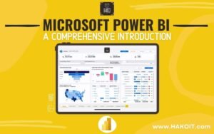
Microsoft Power BI – A Comprehensive Introduction
Create a Report in 60 Seconds with Power BI | Power BI Tutorial
How to use Power BI Embedded – Tutorial Step by step | Microsoft Power BI